









Loading tools... Please wait.
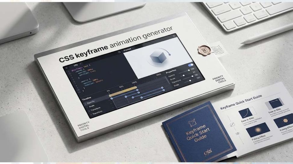
A well-designed website is not only about colors, typography, and layout. Smooth animations can make buttons, cards, menus, banners, and other interface elements feel more interactive and engaging. A CSS Keyframe Animation Generator helps developers and designers create CSS animations faster by generating the required @keyframes code without manually writing every animation step.
What Is a CSS Keyframe Animation?
CSS keyframe animation is a technique used to control how an HTML element changes from one visual state to another over time. Developers define one or more keyframes and specify properties such as position, opacity, rotation, scale, or color.
The @keyframes rule is the foundation of this animation technique. You can learn more about the concept from CSS animations on Wikipedia.
What Is a CSS Keyframe Animation Generator?
A CSS Keyframe Animation Generator is an online tool that simplifies the process of creating animated CSS code. Instead of manually calculating percentages and writing multiple CSS declarations, you can configure animation steps and generate ready-to-use code.
This can be particularly helpful for beginners who are learning CSS as well as experienced developers who want to speed up repetitive front-end work.
Why Use a CSS Animation Generator?
- Save Development Time: Generate animation code without writing every keyframe manually.
- Beginner Friendly: Create animations without advanced CSS knowledge.
- Visual Experimentation: Test different movement and timing effects quickly.
- Ready-to-Use Code: Copy the generated CSS directly into a project.
- Consistent Results: Keep animation properties organized and structured.
- Faster Prototyping: Build animated interface concepts more quickly.
How CSS Keyframes Work
Keyframes describe the visual states of an element during an animation. For example, an animation can start with an element at opacity: 0 and finish with opacity: 1.
A simplified CSS animation may look like this:
@keyframes fadeIn {
  from {
    opacity: 0;
  }

  to {
    opacity: 1;
  }
}
The animation can then be applied to an element using the animation property.
Understanding Animation Percentages
CSS keyframes can use from and to, but they can also use percentages such as 0%, 50%, and 100%. Percentages are useful when an animation needs several intermediate states.
| Keyframe | Purpose | Example |
|---|---|---|
| 0% | Starting state | opacity: 0 |
| 50% | Intermediate state | transform: scale(1.1) |
| 100% | Final state | opacity: 1 |
Popular CSS Animation Effects
There are many animation styles that can be created with CSS keyframes. Simple effects such as fade-in, slide-in, bounce, rotation, zoom, shake, and pulse are commonly used in modern websites.
You can also combine multiple CSS properties to create more advanced effects. For example, an element can move horizontally while changing its opacity and scale at the same time.
CSS Transform and Keyframe Animation
The transform property is frequently used with keyframe animations. It allows developers to move, rotate, scale, or skew an element without changing the normal document flow in many common cases.
Properties such as translate(), rotate(), and scale() can therefore be combined with keyframes to create smooth interface effects.
Animation Duration and Timing
Creating the keyframes is only one part of a CSS animation. The animation-duration property controls how long the animation takes to complete, while timing functions control the pace of the transition.
Common timing functions include linear, ease, ease-in, ease-out, and ease-in-out. Choosing the appropriate timing function can make an animation feel more natural.
Animation Iteration and Direction
CSS also allows developers to control how many times an animation runs. The animation-iteration-count property can be used for a specific number of repetitions or for an infinite loop.
Animation direction can also be changed using properties such as alternate and reverse. These options are useful for effects such as floating objects, pulsing buttons, and continuous movement.
CSS Animation for Buttons
Buttons are one of the most common places where CSS animations can improve user interaction. A subtle hover animation can make a button feel responsive without distracting the visitor.
For example, a button can slightly increase in size, move upward, change its shadow, or modify its opacity when the user interacts with it. The key is to keep the effect subtle and purposeful.
CSS Animation for Website Cards
Cards containing products, services, courses, or blog posts can also benefit from carefully designed animations. A card may slide into view, fade in when the page loads, or gently move when the user places the cursor over it.
Animation should support the content rather than compete with it. Excessive movement can make a website harder to use, especially on pages containing many animated elements.
CSS Keyframes for Loading Effects
Loading indicators are another practical use of keyframe animations. A spinner, pulsing circle, moving bar, or bouncing dot can communicate that an operation is still in progress.
Because these effects can often be created entirely with CSS, developers may not need additional JavaScript or image assets for simple loading animations.
Responsive CSS and Animation
An animation that looks good on a large desktop screen may not always work equally well on smartphones. Movement distance, element size, and animation timing should therefore be considered alongside responsive design.
The Responsive CSS Breakpoint Generator can help developers plan responsive layouts for different screen widths. Combining appropriate breakpoints with carefully designed animations can create a better experience across desktop, tablet, and mobile devices.
Glassmorphism and Animated Interfaces
Modern interfaces often combine animation with visual styles such as glassmorphism. Transparent backgrounds, blur effects, borders, shadows, and subtle movement can create a polished user interface when used carefully.
Developers interested in this style can experiment with the CSS Glassmorphism Background Generator. An animated glass-style card, for example, can use keyframes to create a gentle floating or entrance effect.
CSS Animation and JSON Data
Web applications frequently use JSON to exchange structured data between the front end and back end. Although JSON itself does not create CSS animations, developers may combine JSON-based content with CSS animations to build dynamic interfaces.
For example, a web application could load product or user information from JSON and then use CSS classes to animate each item when it appears. Developers working with structured data can also use the XML to JSON Converter when converting XML-based information into JSON format.
CSS Animation for Web Developers
For front-end developers, animation generators can be useful during the prototyping stage. Instead of spending time repeatedly adjusting keyframe percentages and CSS properties, developers can experiment with an effect and then refine the generated code.
For detailed browser-compatible CSS references, MDN’s CSS @keyframes documentation is a valuable resource for understanding the syntax and available options.
Benefits for Beginners
CSS animation can initially appear complicated because it involves multiple properties, timing functions, transformations, and keyframe stages. A generator provides a visual and practical way to understand how these pieces work together.
After generating an animation, beginners can inspect the CSS code and gradually learn how each property affects the final result. This makes an animation generator useful not only as a productivity tool but also as a learning aid.
Best Practices for CSS Animations
- Keep animations short and purposeful.
- Avoid unnecessary movement on important content.
- Use transforms where appropriate for smooth effects.
- Test animations on mobile and desktop screens.
- Choose timing functions that match the intended movement.
- Avoid using too many animations on the same page.
- Consider users who prefer reduced motion.
Accessibility and Reduced Motion
Some visitors may experience discomfort from excessive movement or animated visual effects. Modern websites should therefore consider accessibility when adding animation.
Developers can use the prefers-reduced-motion media feature to provide a less animated experience for users who have enabled reduced-motion preferences in their operating system or browser.
How to Create an Animation with a Generator
- Choose the type of animation you want to create.
- Define the starting visual state.
- Add intermediate keyframe stages if required.
- Set properties such as transform, opacity, or position.
- Choose the animation duration and timing function.
- Set the iteration count and animation direction.
- Preview the result.
- Copy the generated CSS code into your project.
- Test the animation on different devices and screen sizes.
When Should You Use a CSS Animation Generator?
A generator is especially useful when you need a quick visual effect for a landing page, portfolio, dashboard, online store, blog, SaaS application, or interactive web component. It is also helpful when experimenting with different animation ideas before adding them to a production website.
For simple animations, generated CSS can often be copied directly and customized later. For complex applications, however, developers should still understand the underlying CSS so they can optimize and maintain the code properly.
Final Thoughts
A CSS Keyframe Animation Generator can make modern web animation much easier to create. From simple fade effects and button interactions to more advanced movement and loading animations, CSS keyframes provide developers with a flexible way to add motion without relying on heavy external libraries.
Using a generator together with responsive CSS techniques, modern interface styles, and proper accessibility practices can help you create websites that are both attractive and practical. The most effective animations are usually the ones that improve interaction and visual feedback while remaining fast, subtle, and easy to understand.
Leave a Reply