
Loading tools... Please wait.
Modern websites need to work smoothly on desktops, laptops, tablets, and smartphones. Because screen sizes vary so much, developers need a reliable way to adjust layouts for different devices. A Responsive CSS Breakpoint Generator makes this process easier by helping designers and developers create suitable CSS breakpoints for responsive web layouts without manually calculating every screen width.
What Is Responsive Web Design?
Responsive web design is an approach to building websites that adapt their layout and content to different screen sizes and devices. Instead of creating a completely separate website for mobile users, responsive design allows the same website to rearrange itself according to the available screen space.
Responsive design commonly uses flexible layouts, relative units, responsive images, and CSS media queries. You can learn more about the concept from Responsive Web Design on Wikipedia.
What Is a CSS Breakpoint?
A CSS breakpoint is a point at which the design changes according to the viewport width or another media condition. Breakpoints are commonly used with CSS @media queries to modify layouts, typography, navigation, spacing, and other interface elements.
For example, a website might display three columns on a wide screen but change to two or one column when the available width becomes smaller. The breakpoint tells the browser when those layout changes should occur.
What Is a Responsive CSS Breakpoint Generator?
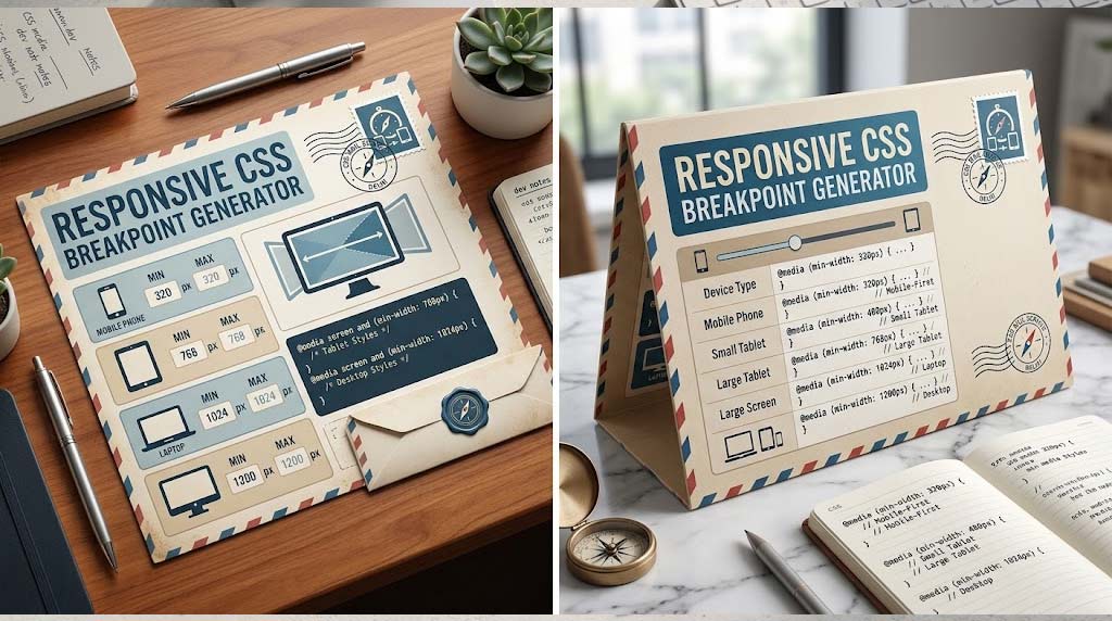
A Responsive CSS Breakpoint Generator is a tool that helps developers create breakpoint values and corresponding CSS media-query code. Instead of manually writing every media query, users can define their preferred screen widths and generate a starting point for responsive CSS.
This can save time during website development and make it easier for beginners to understand how responsive layouts work.
Why Are CSS Breakpoints Important?
- Mobile Compatibility: Helps websites adapt to smaller smartphone screens.
- Tablet Support: Makes layouts easier to manage on medium-sized devices.
- Desktop Layouts: Allows wider screens to display additional columns and content.
- Better Readability: Helps adjust fonts, spacing, and content width.
- Flexible Navigation: Makes it possible to change desktop menus into mobile-friendly navigation.
- Faster Development: Generates useful breakpoint code without writing everything manually.
How CSS Media Queries Work
CSS media queries allow developers to apply specific styles when certain conditions are met. A common condition is viewport width.
A simple example is:
@media (max-width: 768px) {
  .container {
    width: 100%;
  }
}
In this example, the specified style is applied when the viewport is 768 pixels wide or smaller.
Common Breakpoint Sizes
Developers often use familiar device widths as a starting point, but there is no universal set of breakpoint values that works perfectly for every website. The correct breakpoint should be based on when the layout actually needs to change.
| Screen Type | Approximate Width | Typical Layout |
|---|---|---|
| Small Mobile | Up to 480px | Single-column layout |
| Mobile / Small Tablet | 481px–768px | Flexible single or two-column layout |
| Tablet / Laptop | 769px–1024px | Two or more columns |
| Desktop | 1025px and above | Wide multi-column layout |
These values are only examples. A better approach is to select breakpoints based on the content and design rather than targeting specific device brands.
Mobile-First CSS Approach
Many modern developers use a mobile-first approach. The website is first designed for smaller screens, and additional styles are progressively added for larger screens.
This method can make responsive CSS easier to maintain because the basic layout starts with fewer assumptions. Larger screens can then receive additional columns, spacing, navigation options, or visual enhancements.
Desktop-First vs Mobile-First
| Approach | Starting Point | Best Use |
|---|---|---|
| Mobile-First | Small screens | Modern responsive projects |
| Desktop-First | Large screens | Adapting an existing desktop-focused design |
Neither approach is automatically correct for every project. The most important factor is maintaining a layout that remains usable and readable at different viewport sizes.
Breakpoint Generator for Website Layouts
A breakpoint generator can be particularly useful when a website contains several responsive components. Developers can establish a set of breakpoints and then apply them consistently to containers, grids, navigation menus, cards, and other components.
For example, a desktop product grid might display four items per row, reduce to three on a medium screen, two on a tablet, and one on a small mobile screen.
Responsive Typography
Breakpoints are not only about changing the number of columns. Typography can also be adjusted for smaller screens. Large headings that look comfortable on a desktop may occupy too much space on a smartphone.
Developers can use media queries, relative units, or modern CSS functions such as clamp() to create more flexible typography. This helps maintain comfortable reading across different screen widths.
Responsive Navigation
Navigation is one of the most important components to consider when designing responsive websites. A horizontal desktop menu may not fit comfortably on a narrow mobile display.
At an appropriate breakpoint, developers can switch to a compact menu, stacked navigation, or another mobile-friendly pattern. The exact breakpoint should be determined by when the navigation begins to become crowded.
Responsive Cards and Content Sections
Cards are widely used for courses, products, services, blog posts, dashboards, and calculators. A responsive card layout should adjust automatically as the viewport becomes narrower.
For example, a health website may display several calculator cards in a row on desktop and stack them vertically on mobile. An Ideal Weight for Height Calculator can be presented in a responsive card layout where input fields and results remain easy to use on smaller screens.
Responsive Design for Calculator Tools
Online calculators often contain forms with multiple input fields, dropdowns, buttons, and result areas. If these elements are not responsive, users may need to zoom or scroll horizontally on mobile devices.
A Walking Calorie Burn Calculator, for example, can use a responsive form that changes from multiple columns on desktop to a simple vertical layout on smartphones.
Responsive Tables
Tables can become difficult to read when their number of columns exceeds the available mobile screen width. Developers can use horizontal scrolling, stacked layouts, or selective hiding of non-essential information depending on the content.
A responsive breakpoint strategy helps determine when a table should change its presentation. The goal is to preserve important information without forcing users to zoom in or repeatedly scroll across the page.
Responsive Design for Health Information
Health calculators and information tools need especially clear interfaces because users may access them from different devices. Input fields, result values, labels, and explanatory text should remain readable and easy to interact with.
For example, a Total Serum Bilirubin Calculator can benefit from a mobile-friendly form and clearly separated result section. Responsive design should improve usability without changing the underlying health information or calculations.
How to Choose the Right Breakpoint
One common mistake is selecting breakpoints solely because they represent popular smartphone or tablet sizes. A more practical method is to resize the browser and observe when the layout starts to look crowded, overlap, or become difficult to use.
That point is often a better breakpoint than an arbitrary device width. This approach is known as content-based responsive design because the design determines when the layout needs to change.
Benefits of Using a Breakpoint Generator
- Faster Prototyping: Quickly create an initial responsive CSS structure.
- Less Manual Work: Reduce repetitive media-query writing.
- Better Organization: Keep breakpoint rules structured.
- Learning Tool: Helps beginners understand media queries.
- Design Testing: Makes it easier to experiment with different responsive layouts.
- Reusable CSS: Generated code can be customized for future projects.
Best Practices for CSS Breakpoints
- Start with the actual content requirements.
- Consider a mobile-first approach for new projects.
- Avoid creating too many unnecessary breakpoints.
- Test layouts at widths between your main breakpoints.
- Check navigation and forms carefully on small screens.
- Use flexible widths instead of relying entirely on fixed pixel values.
- Test both portrait and landscape orientations when appropriate.
- Make sure touch targets remain comfortable on mobile devices.
Common Responsive Design Mistakes
Adding too many breakpoints can make CSS difficult to maintain. Another common problem is designing only for a few popular screen sizes and ignoring the widths in between them.
Developers should also avoid excessive fixed widths, unnecessary horizontal scrolling, tiny text, and buttons that become difficult to tap. Responsive design should focus on the overall user experience rather than simply making a desktop layout smaller.
CSS Breakpoints and Modern Web Development
Responsive CSS remains an important part of front-end development even as modern CSS provides more flexible layout features. Technologies such as Flexbox, CSS Grid, container queries, and responsive functions can reduce the need for traditional viewport-based breakpoints in some situations.
For detailed technical guidance, developers can explore MDN’s CSS Media Queries documentation. Understanding media queries alongside modern layout systems allows developers to create more adaptable interfaces.
Who Should Use a Responsive CSS Breakpoint Generator?
This type of tool can benefit web developers, UI/UX designers, WordPress developers, freelancers, students, and beginners learning front-end development. It is particularly useful when creating landing pages, blogs, e-commerce websites, dashboards, calculators, portfolios, and SaaS applications.
Even experienced developers can use a generator during the early stages of a project to quickly test different breakpoint strategies before refining the final CSS manually.
Final Thoughts
A Responsive CSS Breakpoint Generator can simplify one of the most important parts of modern web development: making a website comfortable to use across different screen sizes. By generating media-query structures and helping developers experiment with breakpoint values, it can save time and make responsive development more accessible.
However, breakpoints should not be chosen only according to device names or fixed industry standards. The best breakpoint is usually the point where your content and layout need to change. When combined with flexible layouts, responsive typography, accessible navigation, and thorough device testing, a well-planned breakpoint strategy can create a smoother experience for every visitor.